Illustrations for A Clockwork Orange
Jones, Ben 
Abstract
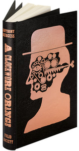
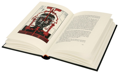
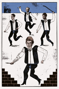
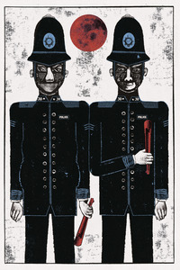
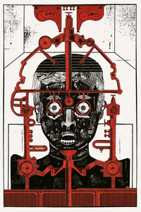
The output is a series of illustration commissioned by the Folio Society in 2014 to illustrate Anthony Burgesses’ ‘A Clockwork Orange’. It includes the binding and seven internal illustrations. Research Process: The brief was to illustrate the book as the text intended rather than in the iconic style that was presented in Stanley Kubrick’s film from 1971. The cover took reference from Kubrick’s film with the use of a bowler hat. There is no reference to bowler hats in the book itself. The illustrations took influence from soviet and eastern European design and illustration as well as from the streets of Manchester. As Burgess quoted that the book takes place somewhere in-between Manchester (Burgess grew up in Manchester) and Moscow. Jones used collage to produce the works using contrasting elements of printmaking, drawing and found imagery. this was to mimic the slang language of Nadsat that is spoken by the characters in the book. Nadsat is a combination of UK slang and Russian. Research Insights: Stanley Kubrick’s film has played a big part in how audiences think about the novel. The use of the bowler hat is significant as part of the cover illustration even though no bowler hats are mentioned in the novel. There is a sense of illustrative works that were produced under the gaze of the iron curtain. By drawing upon cautionary fairy tales and the dystopian version of the city the work conveys a subtle, possible something that exists outside the frame of illustration, something that makes the viewer feel a bit jittery. Dissemination: The illustrations were published in the Folio Society edition of Anthony Burgesses’ ‘A Clockwork Orange’ in 2014.
Actions (login required)
 |
Edit Item |


![[img]](https://lau.repository.guildhe.ac.uk/17529/8.hassmallThumbnailVersion/Image%201.jpg)
![[img]](https://lau.repository.guildhe.ac.uk/17529/9.hassmallThumbnailVersion/Image%202.jpg)
![[img]](https://lau.repository.guildhe.ac.uk/17529/10.hassmallThumbnailVersion/Image%203.jpg)
![[img]](https://lau.repository.guildhe.ac.uk/17529/11.hassmallThumbnailVersion/Image%204.jpg)
![[img]](https://lau.repository.guildhe.ac.uk/17529/12.hassmallThumbnailVersion/Image%205.jpg)